in this stage we are developing 3x10 ft banners, obviously we would not make a file this size...gotta love adjusting the dpi! just think we could be painting baners by hand!
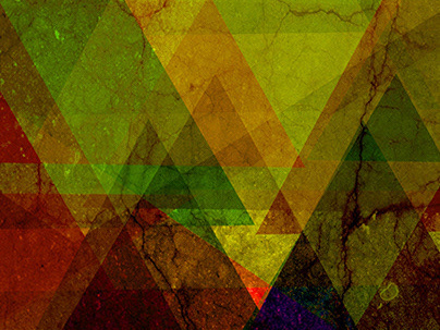
although, I wass supposed to stick with my color pallet of copper and turqoise, I could not resist using these "fiesta" colors! just for fun!
As much as I loved the caption experience the city of the sun, in Latin, apprently, it would be too pretentious so, "the Glory of the Sun" it is... copy is my weak point... I have to work on that. sigh
experience the city of the sun, in latin was too much and I was asked to make it more simple. the photgraphs are not mine, I am only showing them because they were images that made me want to use the colors I did. not to use as property, sort of a contact sheet.
the one on the cover is my final design, and can be used in in single or multiple color combos. the curve cresent at the bottom is to represent the beautiful night sky here as well as the broiing heat.
A quick example of the possible brochure for the pre press class
